Bar Mitzvah Identity
Jewish traditions infused with chocolate and graffiti.
This project has been a great and very unexpected experience. I have learned much about the Jewish community and their traditions. A friend and colleague referred a client who wanted to create an invitation printed on wood and we met. Her name is Marta, and she was planning a Bar Mitzvah for her son Robert. Bar Mitzvah is a Jewish celebration of a boys coming-of-age at age thirteen. The client wanted an invitation with weight and tactile presence, like a tablet. Since Robert is very fond of nature, the event was being developed around the theme of nature and wood. I needed to learn more about this ceremony and Jewish traditions so the research began...

Reference http://sixpoint.com
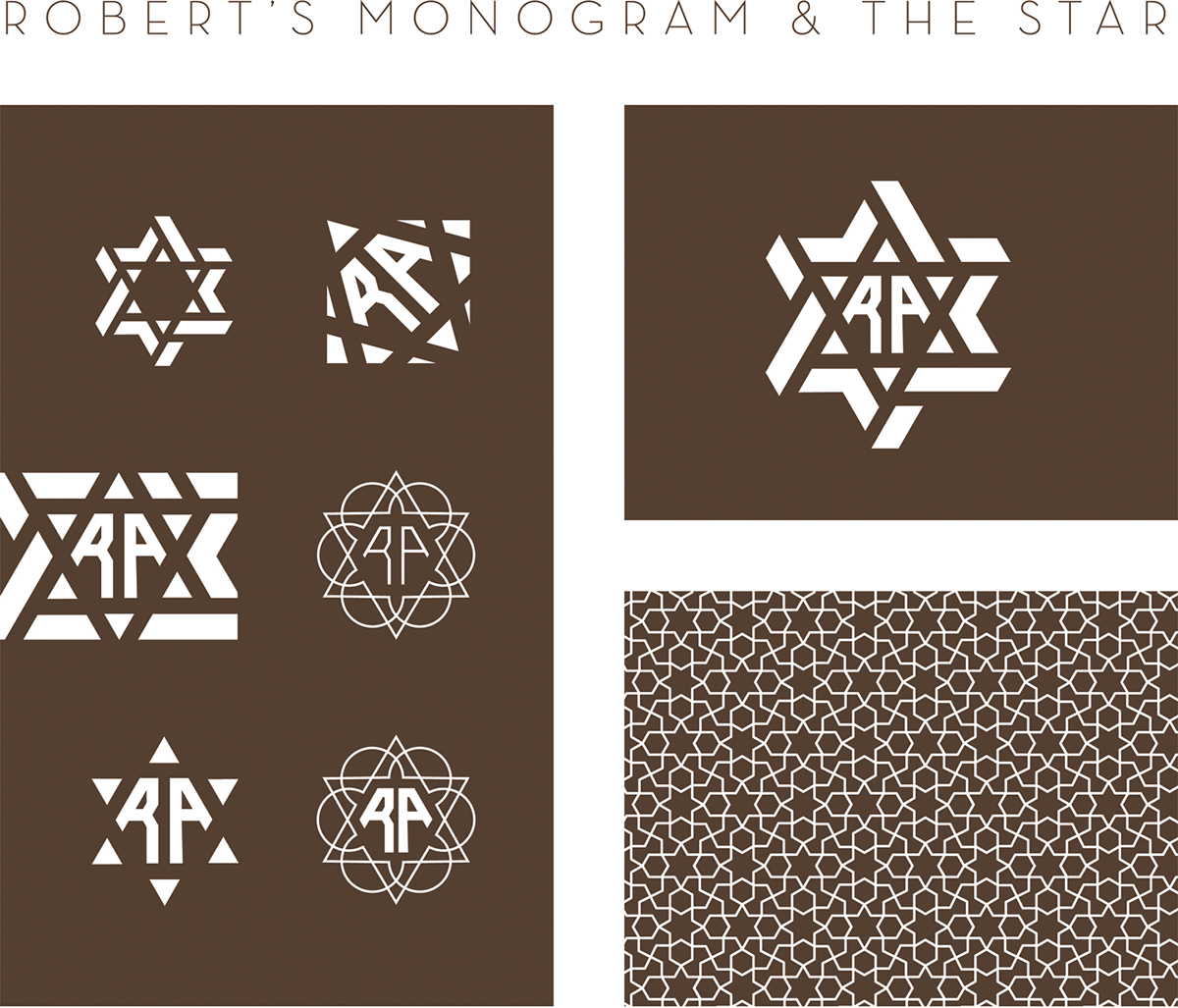
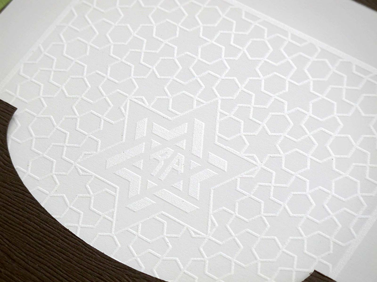
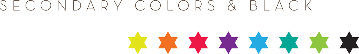
The research showed that the six-pointed star, also known as the Star of David, is an iconic Jewish symbol dating back to the 3rd and 4th century. Its symbolism originated in alchemy, meaning harmony, balance and peace. I also found other uses and associations to this symbol. It is integrated in the Great Seal of Solomon, and symbolizes harmony of opposites, cosmicorder and theperpetual flow between heaven and earth, wisdom, power and divine grace. In the 14th century it was used by brewers as a branding symbol of quality and origin, and later became the official insignia of the Brewer's Guild. Most recently the BGD or "Black Gangster Disciples" adopted the star as a symbol for life, loyalty, understanding, knowledge, wisdom, and love. All good!

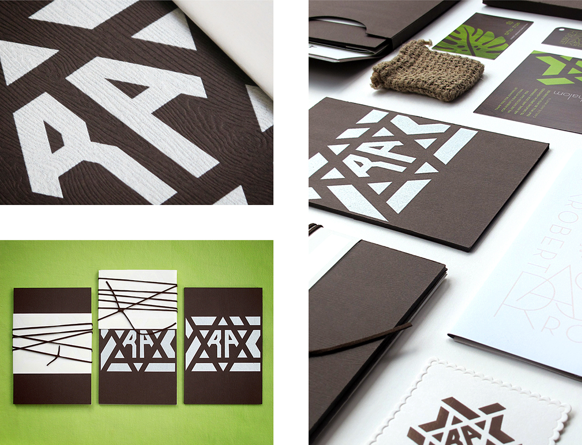
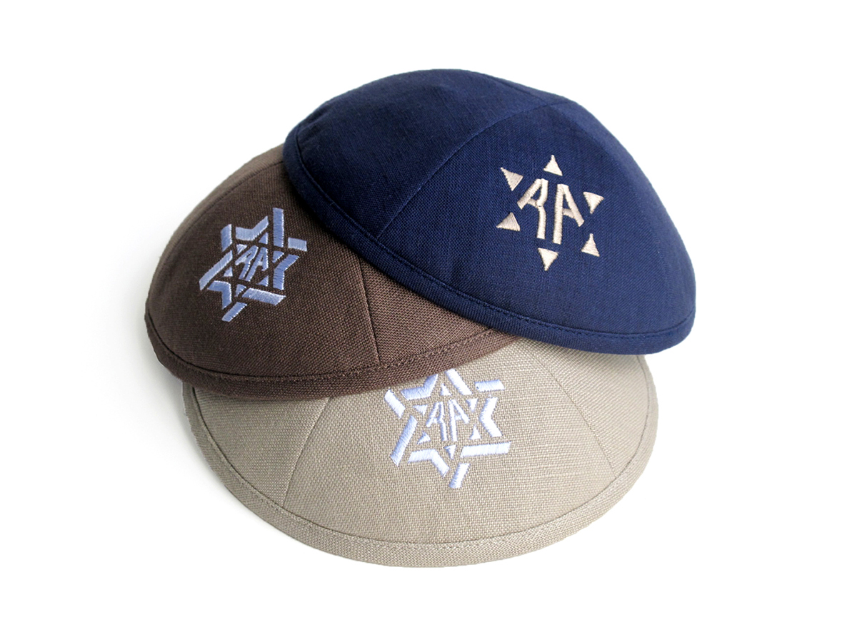
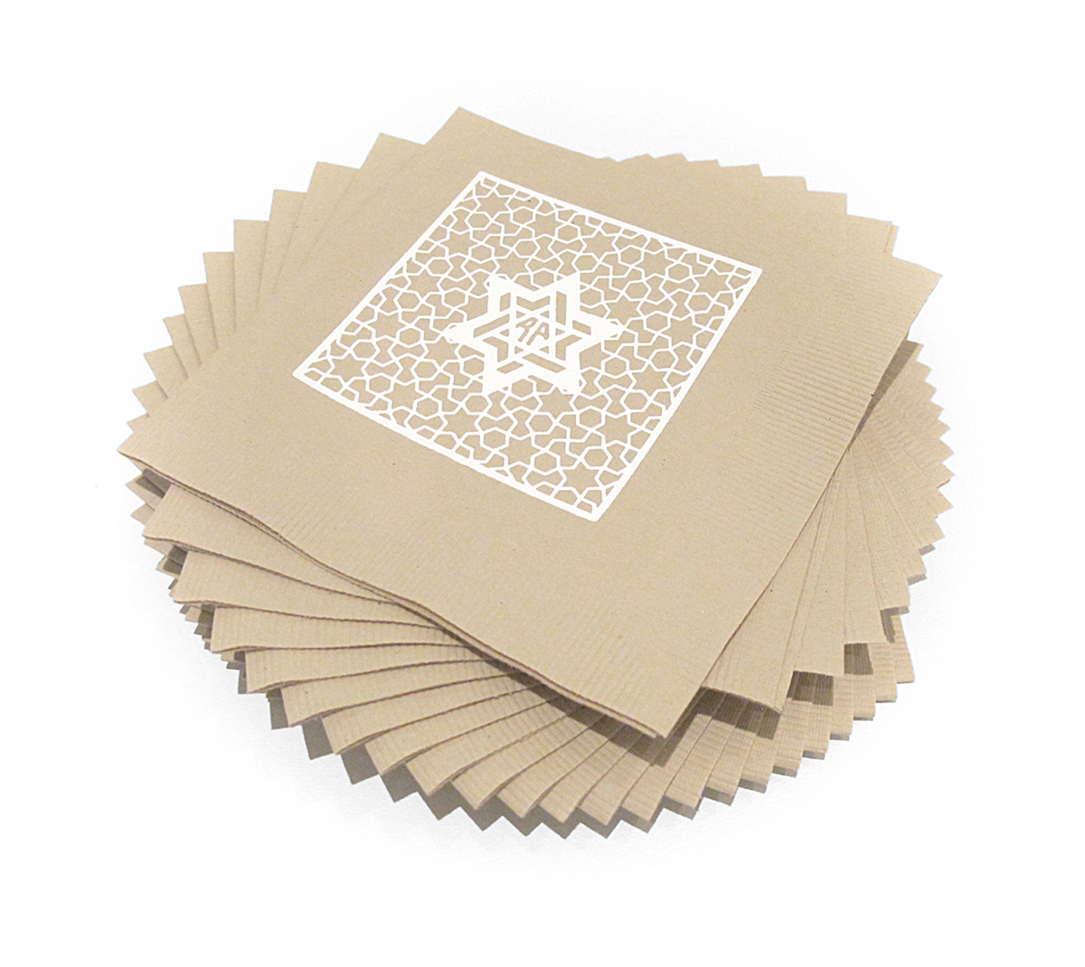
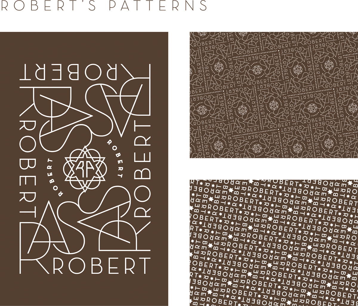
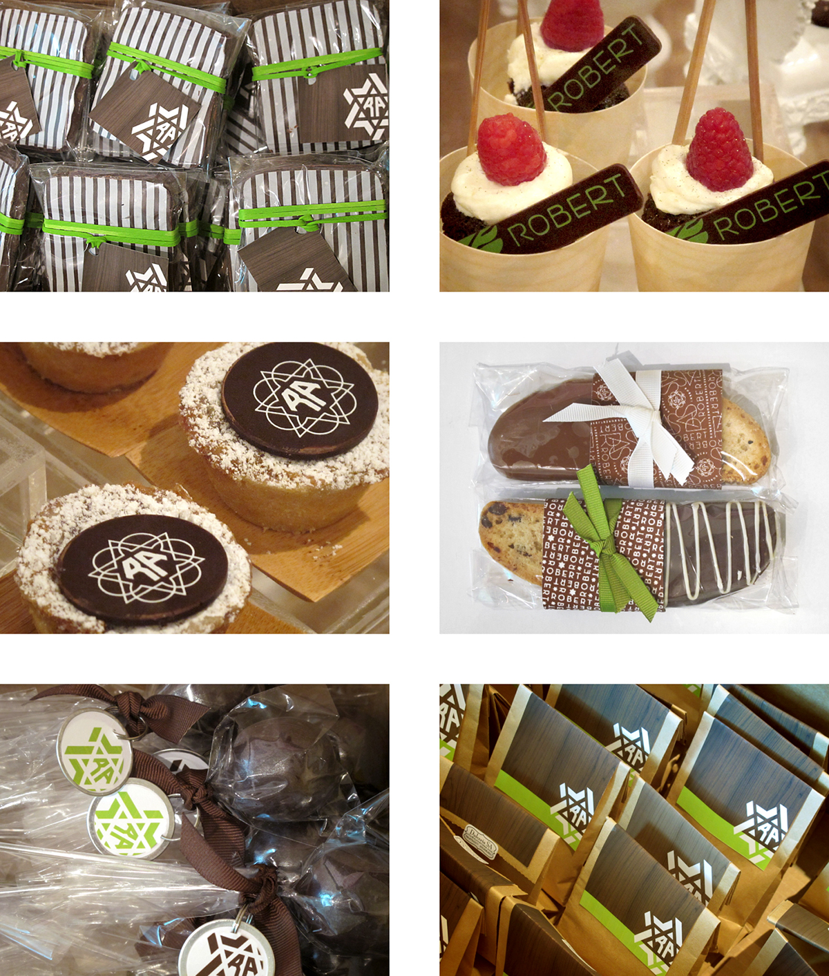
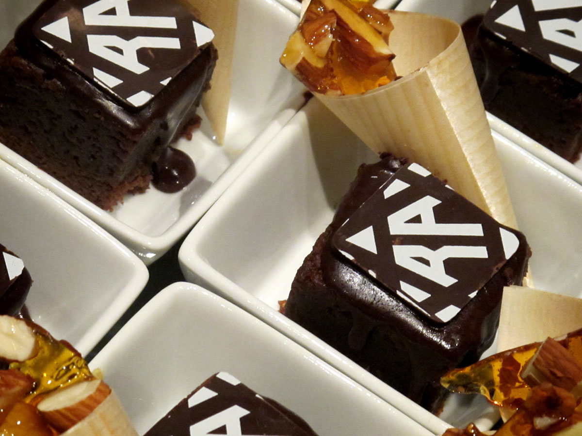
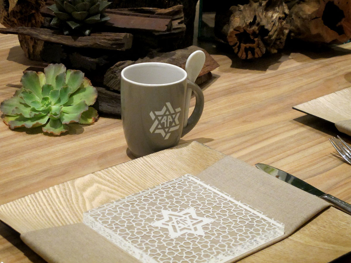
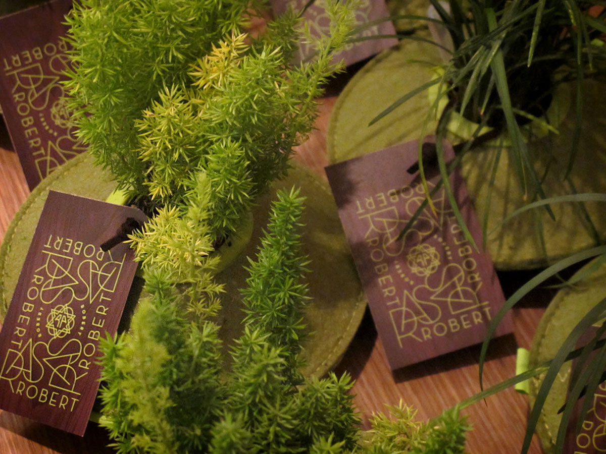
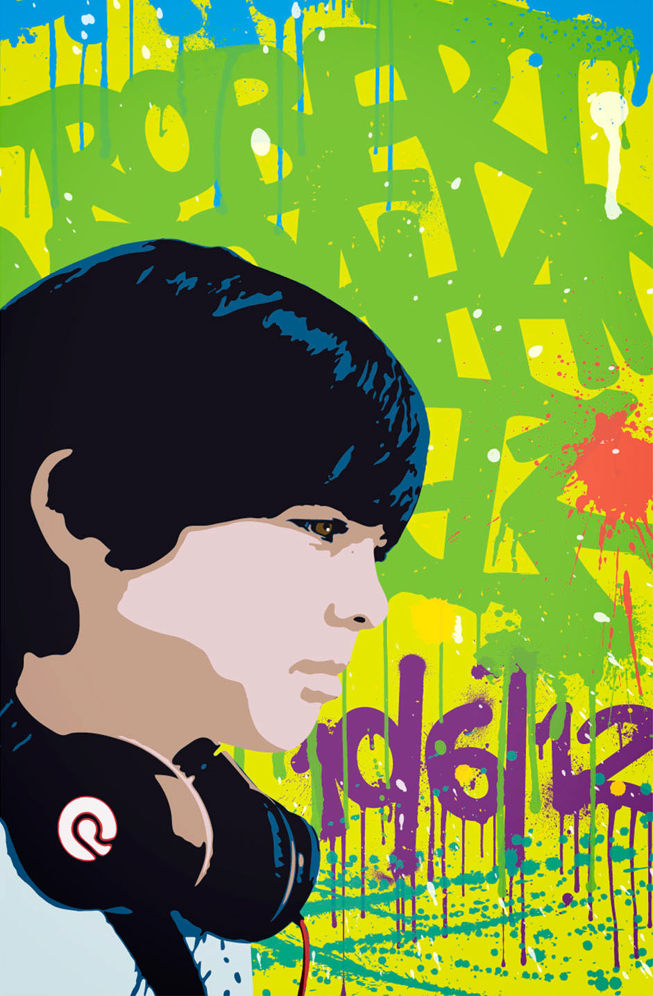
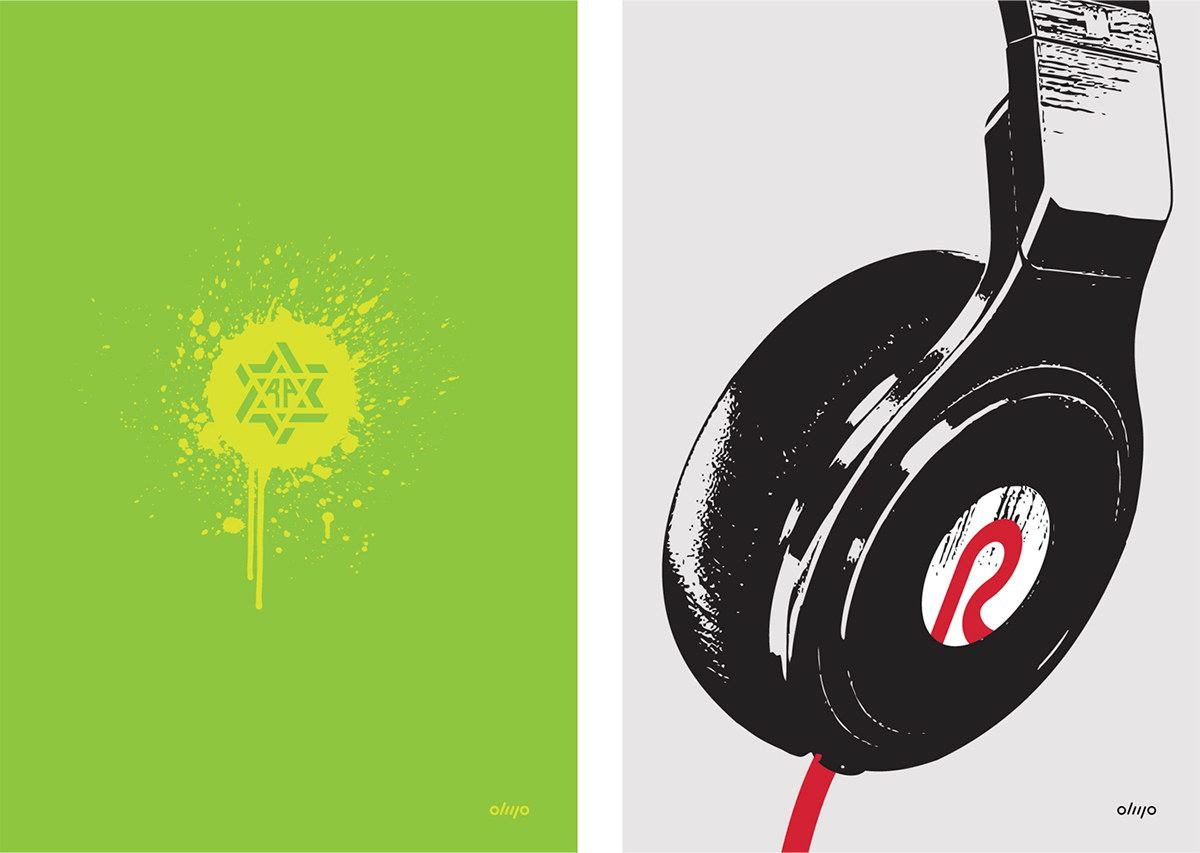
I wanted to create a symbol or monogram for the event's identity and the Star of David seemed appropriate for the occasion. Different shapes and styles were explored and considered. Once a star was selected, other adaptations were developed for multiple applications. The final star selected features Robert's initials as a monogram. The pattern shown below is inspired in a tile pattern found inside a Jewish synagogue.
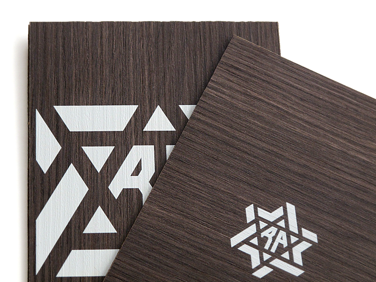
The client wanted white ink on dark wood. I thought balsa wood could work, but it would have to be stained prior to the printing process and it does not have natural wood grain. Then we thought about wood lining or surface laminate sheets, and we tried formica. It looked great on formica but the edges were not smooth and it was not gluing well, since we were creating a duplex or “sandwich” to achieve the desired thickness for the invitation.


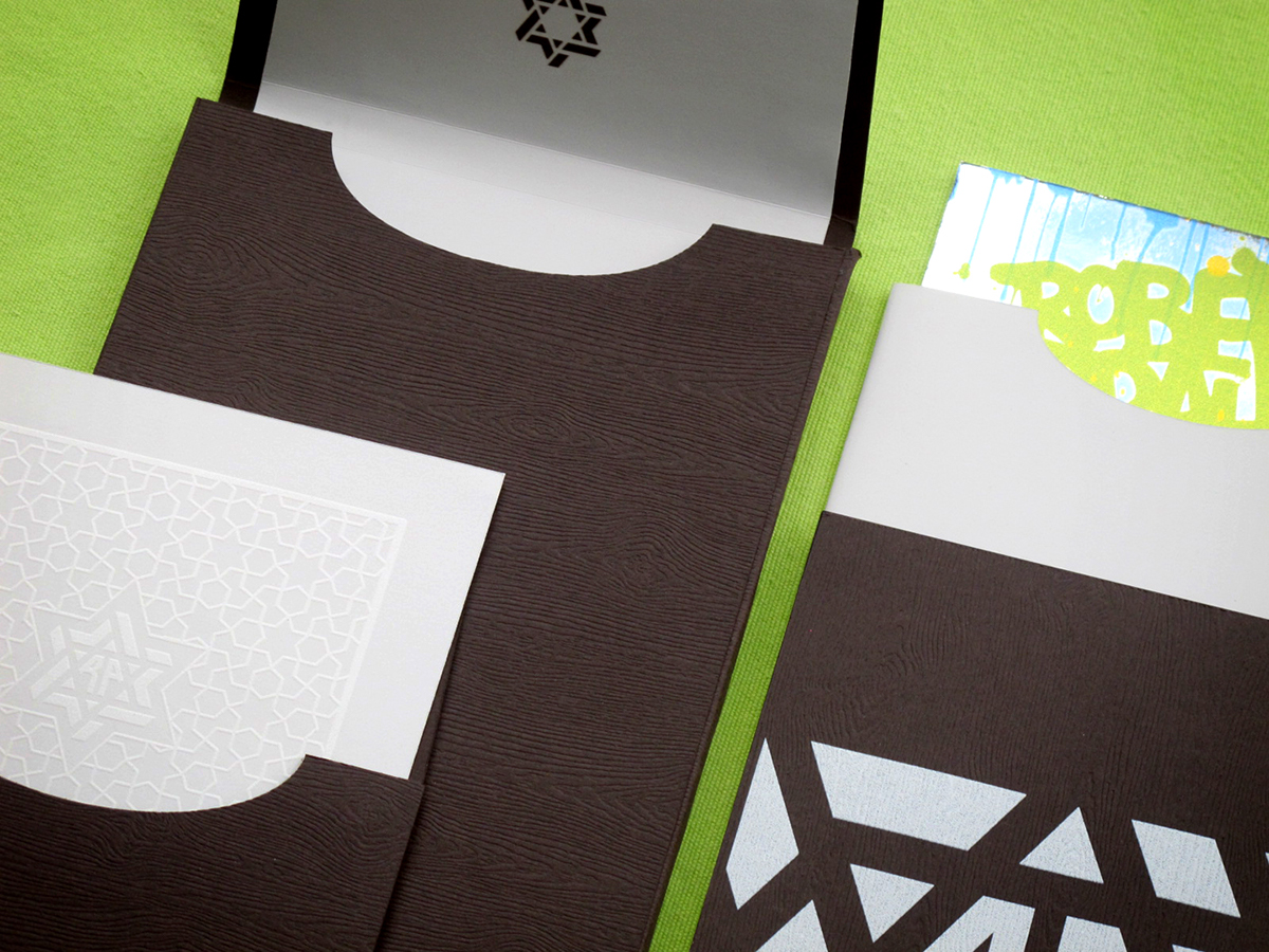
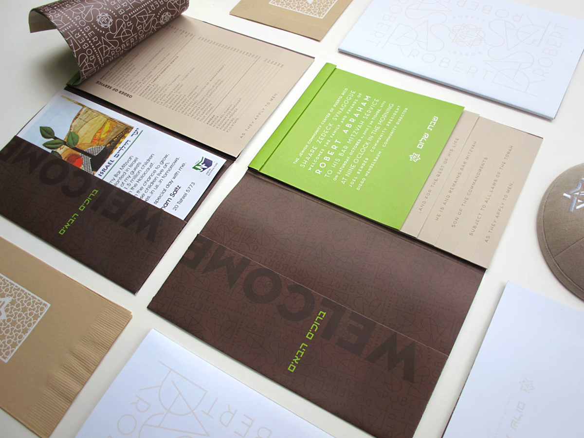
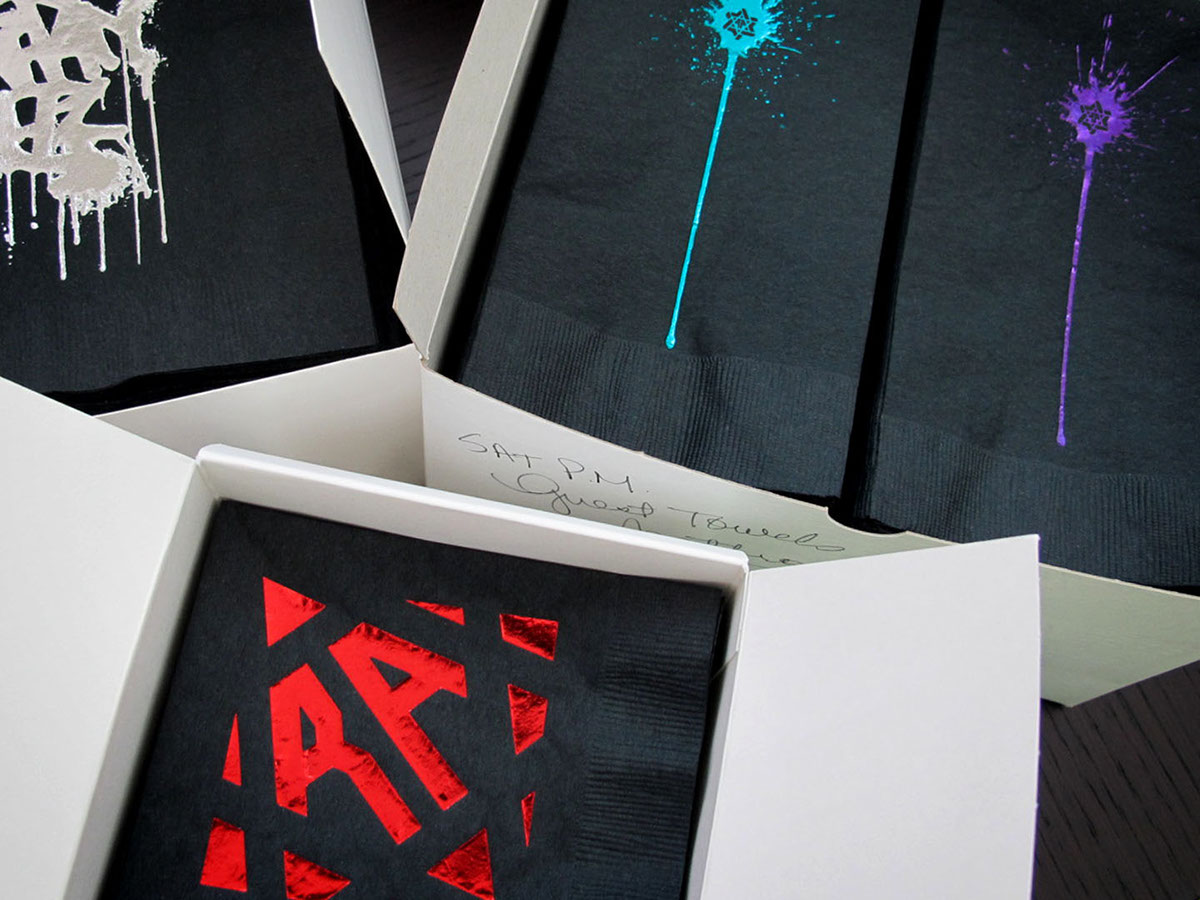
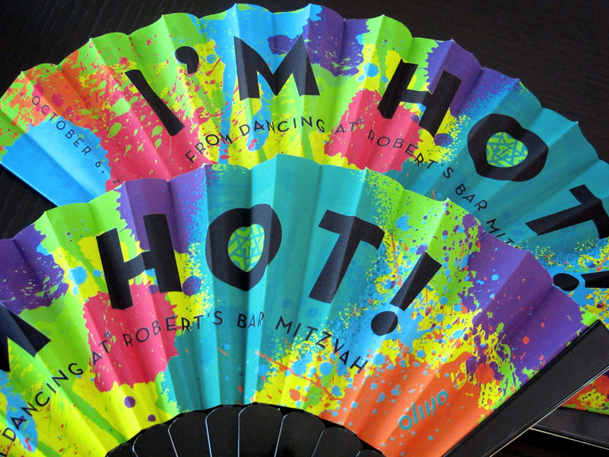
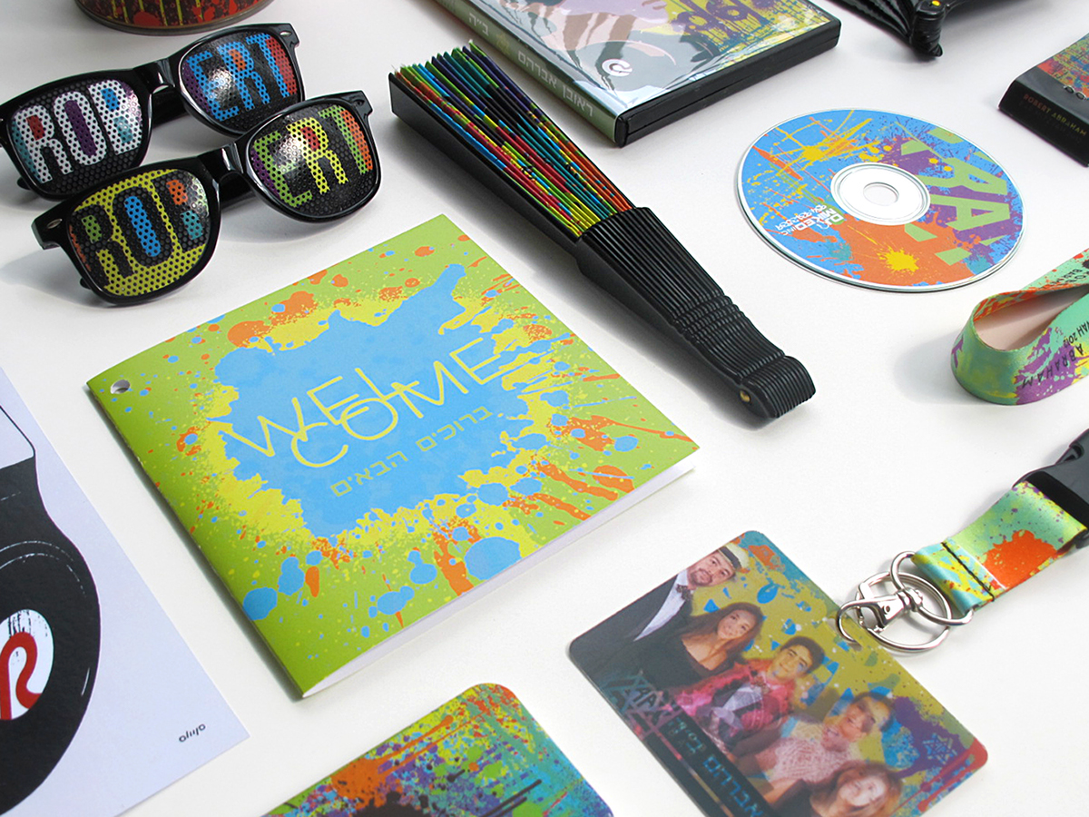
Then we found Gmund Savanna Bubinga Wood Grain Paper! We combined this textured material with Touché White, a beautiful paper that feels like velvet to the touch. The color palette was monochromatic, using brown and white. A bright green color was introduced for details and applied to the second invitation. Yes, two invitations were designed for two separate events and both needed to be packaged together and accompanied by an RSVP card with a pre-stamped envelope. The second invitation was for an evening party with the urban theme of graffiti. To my surprise, the client requested the use of a specific typeface for which she had a visual reference. It was not so easy to find a name for the typeface but two days later I found it. It is called Neutraface and it was originally designed by Richard Neutra, and recently revived by House Industries.

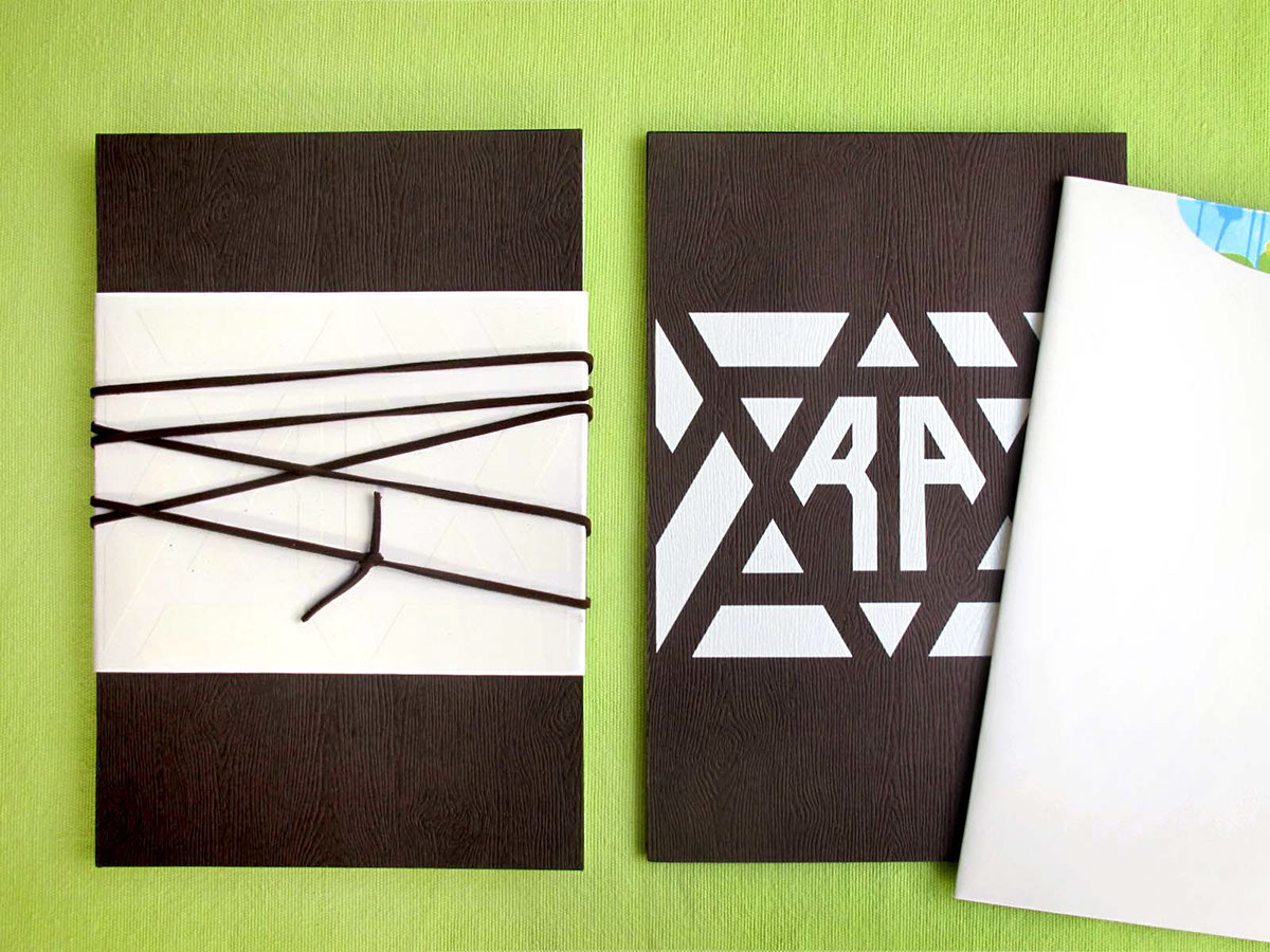
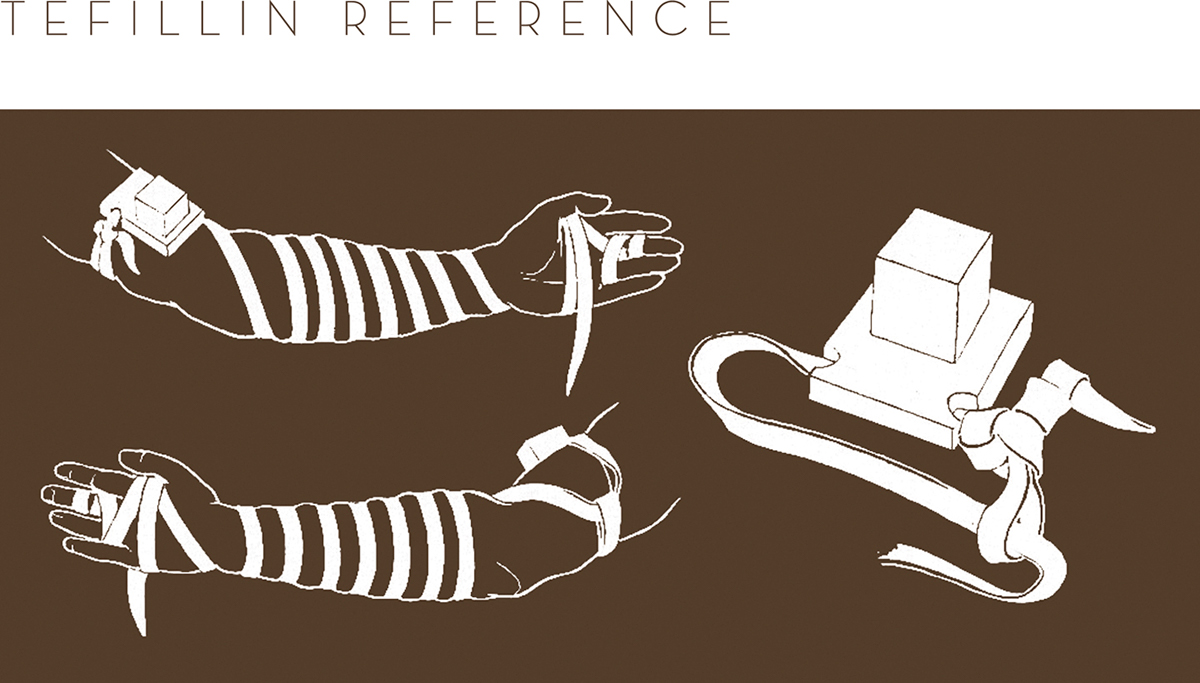
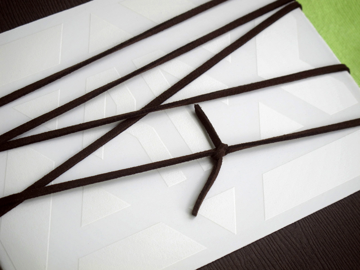
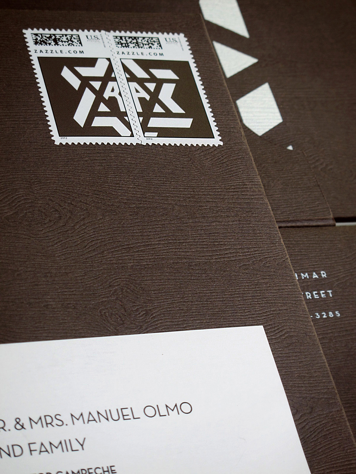
The main event invitation was printed in the wood textured material, while the evening invitation was printed over a silver foiled paper and inserted inside a white sleeve of white Touché cover printed only in the interior. I am not showing the names and personal information of my client to protect their privacy, sorry. Together with the RSVP card and envelope, all the pieces are wrapped inside a white band of Touché and printed in white over white. As a finishing touch the elements are decorated by a leather wrap, simulating the tefillin (see reference below), a set of small black leather boxes containing scrolls of parchment inscribed with verses from the Torah and worn by observant Jews during morning pray as a symbol of remembrance, and mailed inside a box shaped envelope. The final printed invitation comprises 10 separate printed items, including custom mail stamps.
Reference from emp.byui.edu
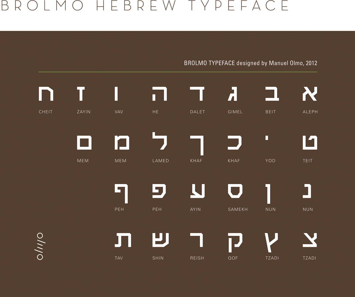
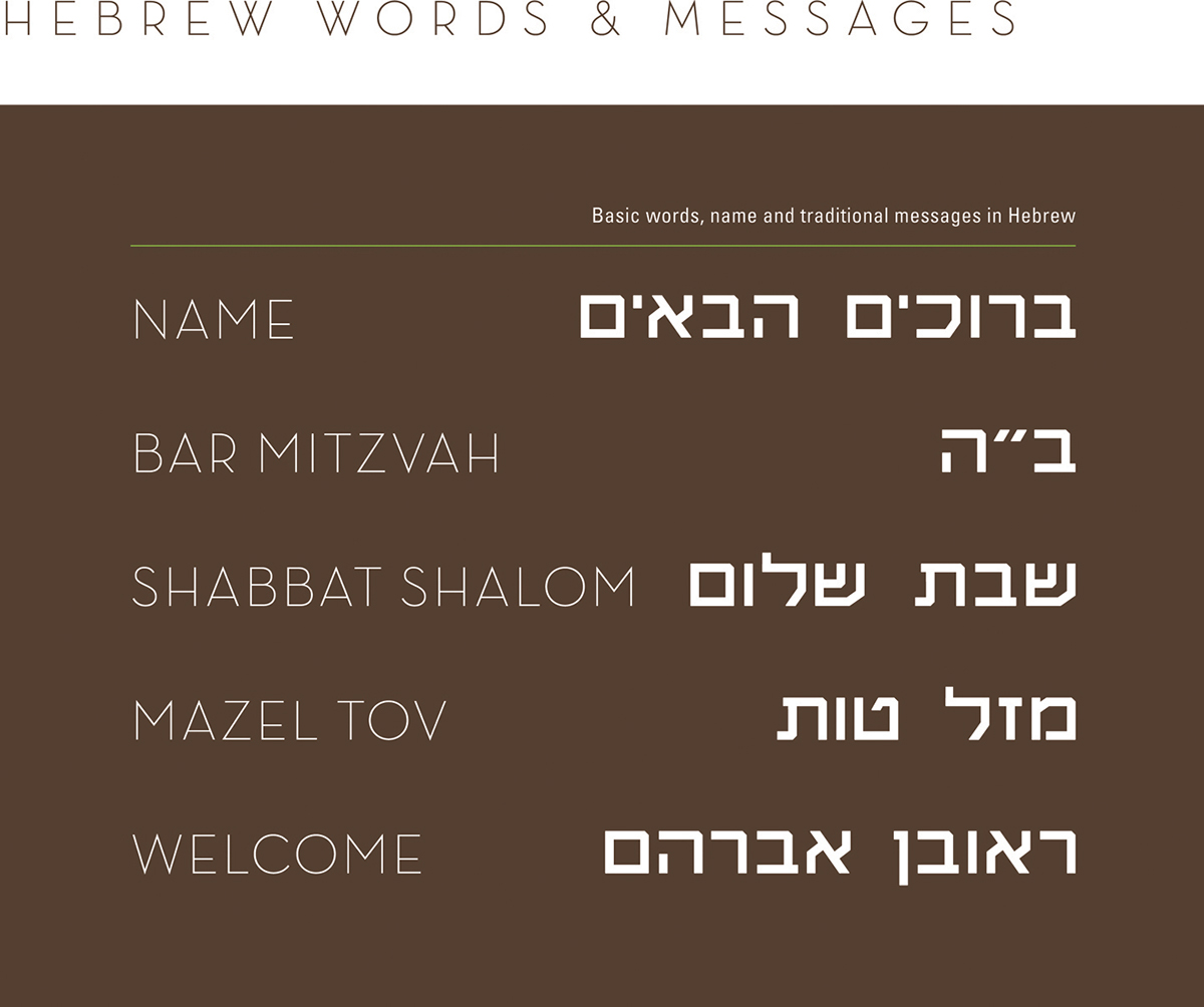
Half way through the process it is brought to my attention that the Hebrew words provided by the synagogue were misspelled, and I decided to create a Hebrew glyph set I could use to add messages in this new and foreign language. For this task I contacted two of my classmates, colleagues and type brothers Gilad Fried and Ron Gilad, both designers are Jewish and living in Israel. They guided me to complete the design of 27 characters, the final typeface was named Brolmo to include my type brothers.


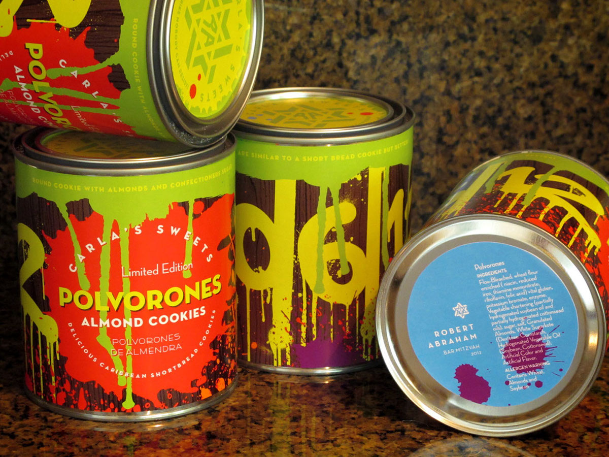
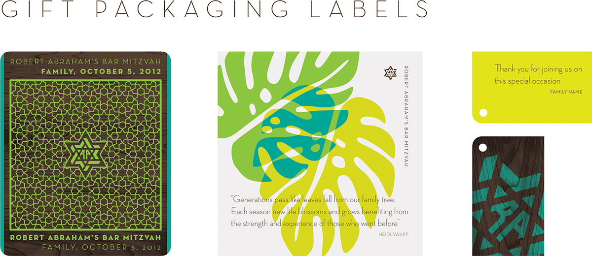
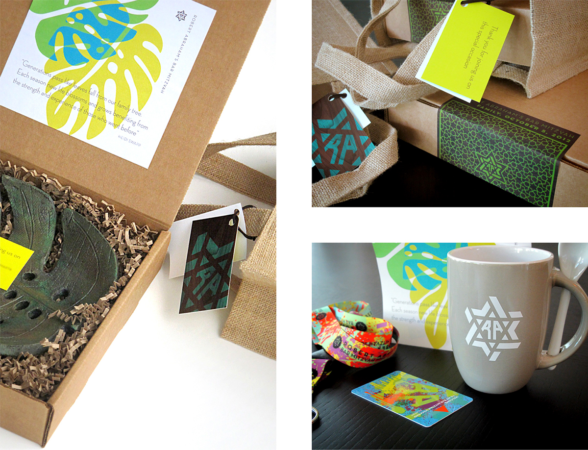
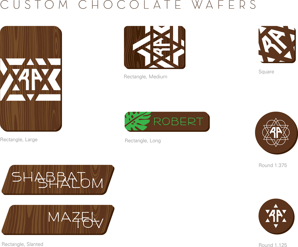
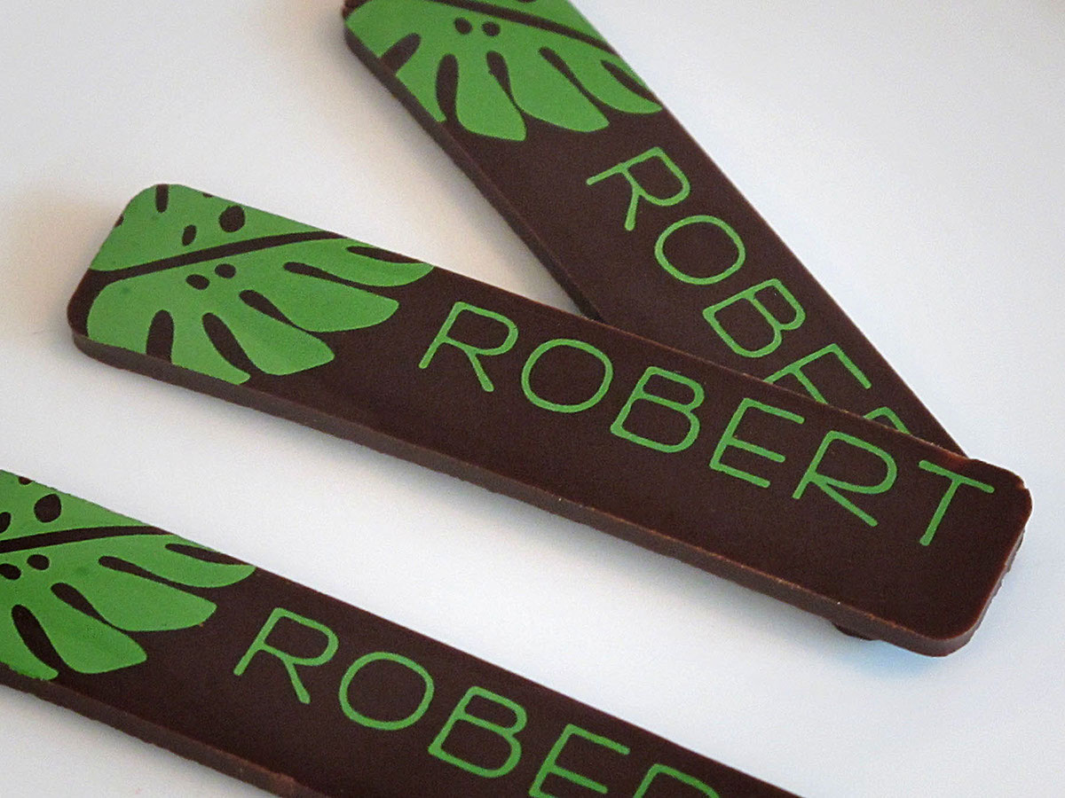
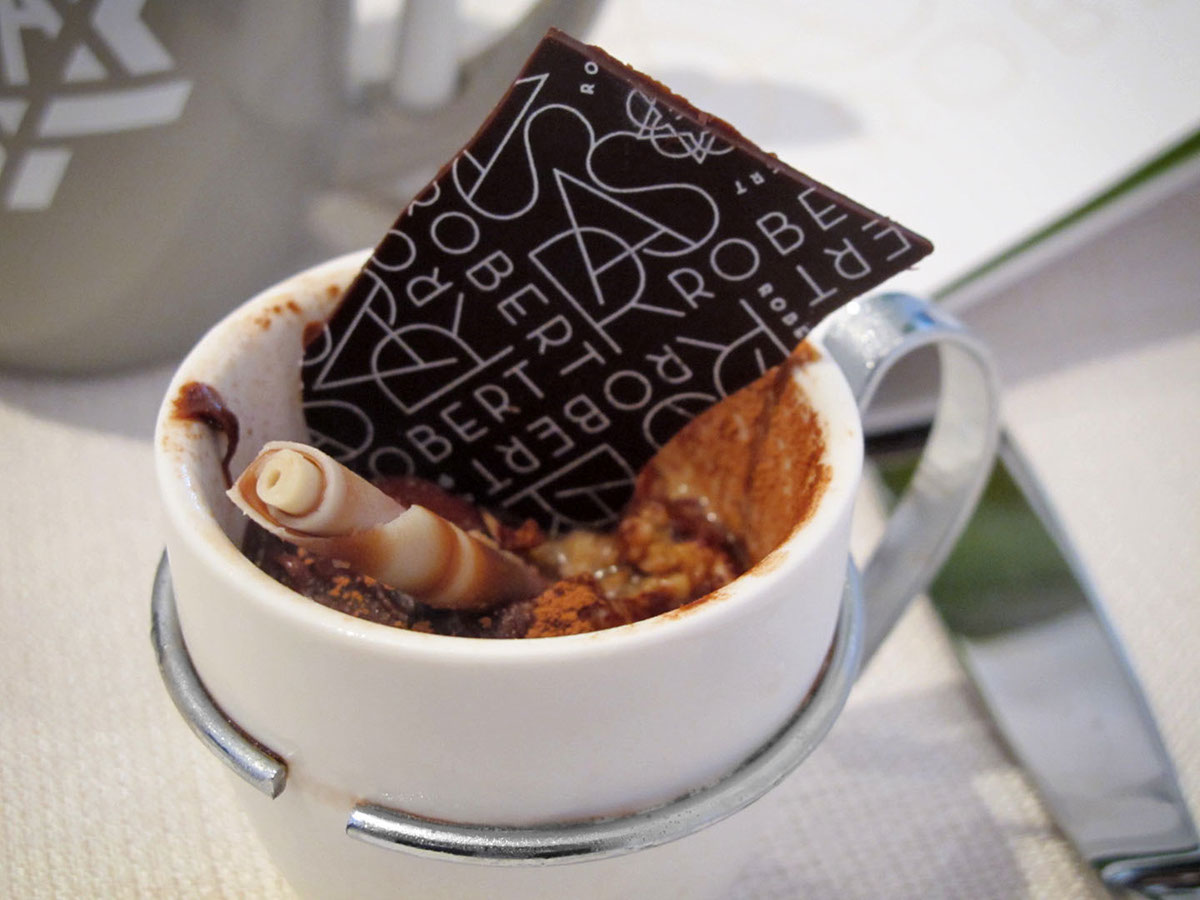
Several chocolate wafers were custom printed to decorate the desserts. The individually wrapped candy and chocolates were labeled and packaged by a third party, using the colors, patterns and designs already created for the occasion and provided by us.


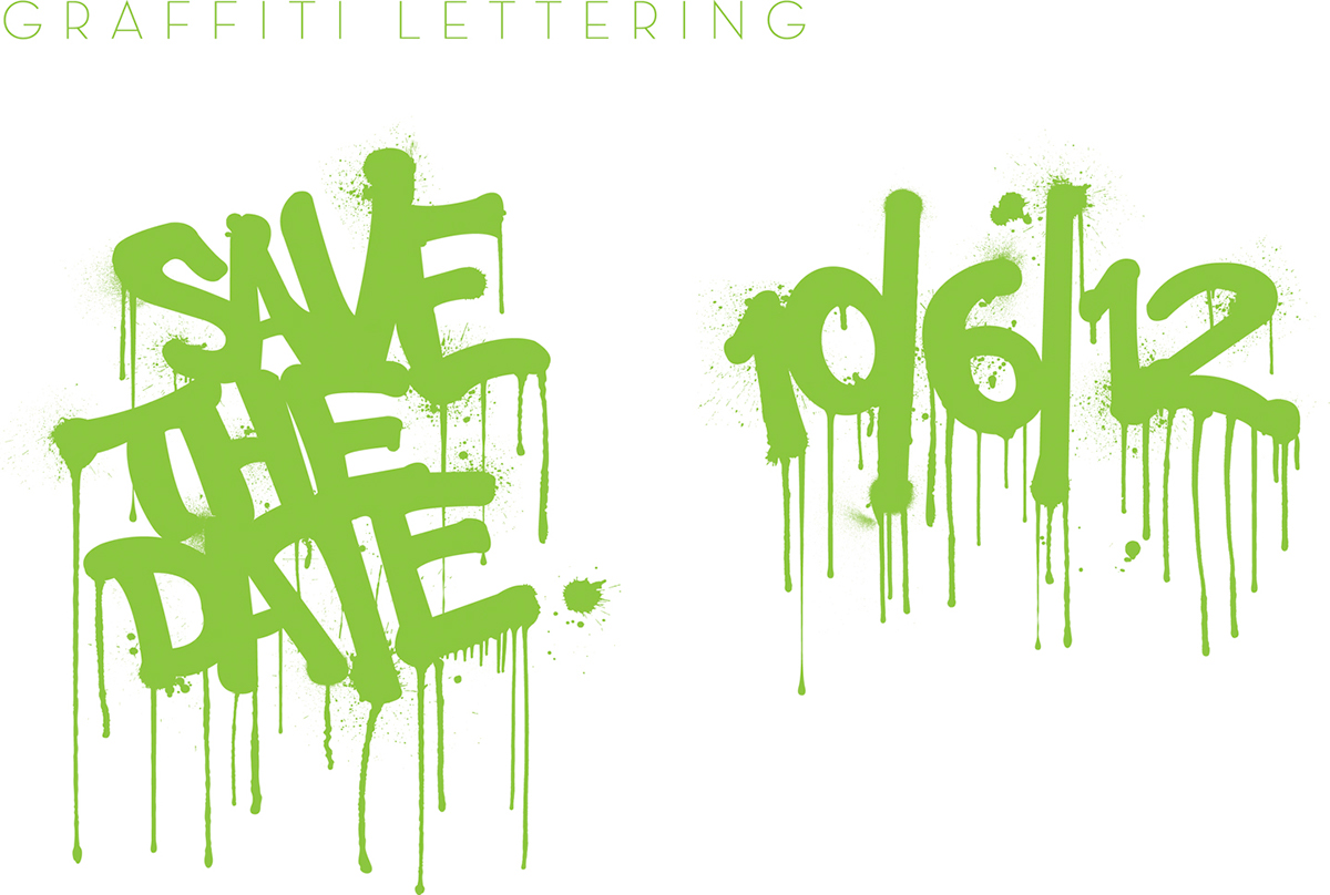
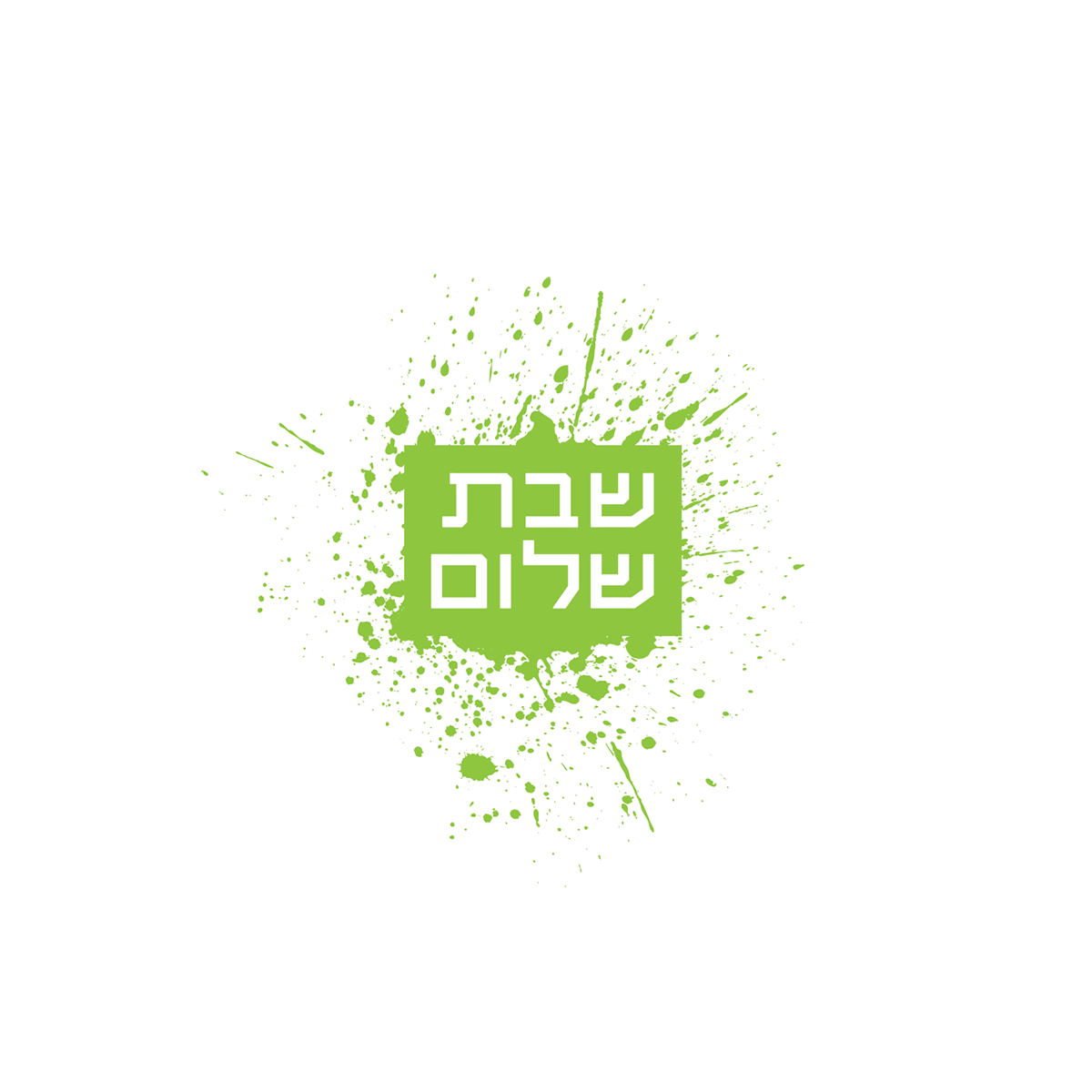
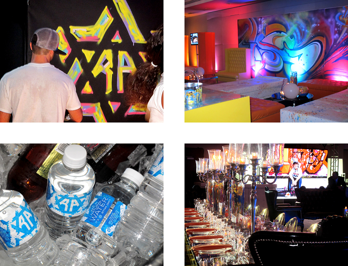
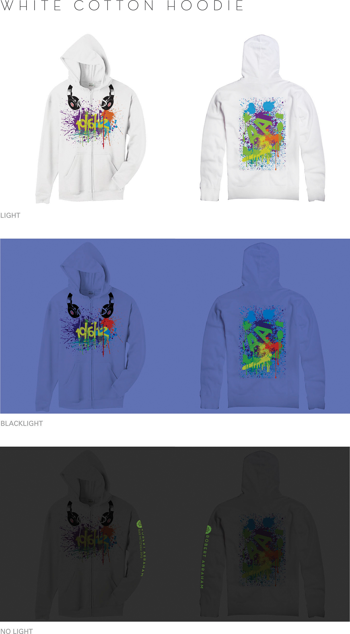
Lettering design was developed for the evening party concept. For this exercise I requested the help of one of my students, Samuel Mojica, together we designed four graffiti messages to be used and displayed in different media. The evening party (or birthday party) included an extended palette with more bright colors and black.


I want to thank Suzette Jimenez and Maribel Ramirez from Model Offset Printers for all their support and personal attention, Lourdes Folch from American Paper for the material suggestions, Nestor López Rivas from Acanthus for the continuous support and beautiful work and my dear client and now friend Marta for trusting me and for the given opportunity. Hope you enjoy it!
© 2012 Designed by Manuel Olmo Rodríguez.
© 2012 Designed by Manuel Olmo Rodríguez.